Thursday, 31 March 2011

Evaluation Q1: Forms And Conventions


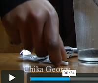
Above you can see various shot from our thriller opening and from that of Seven. We integrated the use of close-up shots that show the detail of the character. We thought this was a good type of shot to use because it hides the identity of the character but at the same time allows the viewer to see something of them. What I mean by that is that the viewer is in a way seing their identity by their hands for example (your fingerprint is a form of identification) and it allows the audience to see things of the character that they would not really focus on if they saw her fully. Also we had our titles to the side of the screen, this relates to both the Stepfather and Seven. In Seven you have the titles in the centre but the go well with what is on screen, and they are not very 'in your face' titles, they are more discrete. In the Stepfather the titles are also to the side of the screen, they are discrete and simple. The title of the movie blends in with what is in the background, it is, like Seven, a discrete title. There shot were the hand is hanging out is similar to the stepfather when the viewer is shown the people that have been murdered, however, we decided again to hide this persons identity leaving it a mistery to the audience, we thought this might make them want to keep watching to reveal the identity of these characters.
Also there is a shot were she is putting make-up on which is a very similar shot to when the guy in the Stepfather is seen in the bathroom mirror when he is in a way trying to hide his identity by shaving,etc. which is what the girl in Dead Line is doing, not changing identity, but putting make-up on to try and show that nothing is going on, she is trying to act normally.

Evaluation Q1. In what ways does your media product use, develop or challenge forms and conventions or real media products?


This is a thriller title sequence from the film 'Se7en'. This shows the 9 shots.


The use of the establishing shot with the production company on front. This is how seven used their opening with the production company.


The use of black screen used in seven really inspired us. We used this in our film and we did black screens and we added the names of people in our group and the role we did.


We did close ups of objects that relate to the character. We got really inspired by seven when they got really big close ups of objects which looked really good. 
  

Here is another close up of the shoulder. We took many shots that are close up as we wanted to create a good feeling of suspense and wanted jerky camera movements. 


Here is another close up of the foot. This part is convenient as the title comes in when the foots steps down the title disappears.  


Here are San serif fonts. We did black screens and added the names and etc. 


Evaluation Q2. How does your media product represent particular social groups?


 Our psychological thriller shows that the character cares a lot about her appearance, this is shown when she re-applies her makeup. Furthermore, the character continues to do what she may do on a 'normal' day such as putting on shoes and fixing her hair and taking the medicine. This really represents her severe mental instability as there not only is there a dead person in the same house as her, they're in the same room as her. Normal people may feel guilty or even frightened for what they have done. But not this character as she is not in the right frame of mind and that is who she really is. 
                                                                        
The act of 'normality' has been inspired by The Stepfather  (2009) The character is carefully changing his appearance and then goes on to make breakfast. This all first tells us that he is all normal then knowing that he has just killed an entire family and they are laying on the floor in the same room as him shows the characters mind and inner self comes out more. This shocks the auidence as first we see a normal guy doing normal things then as the music changes we see bad things appear. Like so in our thriller movie her doing daily girly routine then we see hand layed on the floor all dead. 

Evaluation Q:4/5

Evaluation Q3. Who would be the audience for your media product?

The idea of an ideal viewer for our thriller film is thought to be a female as it is a Romantic-Thriller Genre and also, in her mid-twenties to 40's. 


The reason why i think our film appeals more to females at the age of 20-40 because its an phycological thriller. Also because of how the character is like in our film. When we first see that she is putting her make-up on and etc. 
The type of women i can imagine watching our film is a university student, who really enjoys phycological romantic thrillers and is in her mid-twenties. Also she studies phycology in university and she is familiar with the concept of the characters mind. Also it would be quite easy for her to analiyze and ask her self questions on 'why is she doing this?', 'What has made her do this?' and etc. 


Evaluation Q.3

The idea of an ideal viewer for our thriller film is thought to be a female as it is a Romantic-Thriller Genre and also, in her mid-twenties.
Below is a made up character of which i have created in order to represent the thought of character for our film 'DEAD-LINE'

 Beth Horton is 24 years old and just completing her course in university. She enjoys subjects such as psychology in which she can study the human mind especially those of which are unstable.
She loves social networks and even has her own blog where she reviews physiological thrillers. Her favorite films are Black Swan and DEAD-LINE.
When she watches films like DEAD-LINE she often goes online or meets with fellow students where they discuss the film asking questions kike - 'what made her do this?'  and 'who made her like this?'

Evaluation Q:2

The act of normality like the main character did in the movie stepfather represents a particular social group of curious university graduates aged 24 and over

  In our psychological thriller it is evident that the character cares about her appearance, this is shown when she re-applies her makeup. Furthermore, the character continues to do what she may do on a 'normal' day such as putting on shoes and fixing her hair. This really represents her severe mental instability as there not only is there a dead person in the same house as her, they're in the same room as her! Normal people may feel guilty or even frightened for what they have done. But not this character.
                                                                        
The act of 'normality' has been inspired by The Stepfather  (2009) The character is carefully changing his appearance and then goes on to make breakfast knowing that he has just killed an entire family and they are laying on the floor in the same room as him!!!

Evaluation Q.1


The idea of a black screen with white writing establishing the people involved in making the film is used in SE7EN is used in our thriller opening also.


Close ups of the main character doing something or picking something is also used in both our film opening ans se7ens film opening.


In both our film and Se7en we ensured that the title of our film was placed at the middle of our opening rather than the beginning or end.


In the beginning of both se7en and our film opening, we used a supporting company "presents..."


(body PARTS rather than the whole body)


                                                       ( members  of cast stated)


DIFFERENCES


While our film begins with an establishing shot so that the viewer acknowledges the location of the film. The open of Se7en doesnt do this.


We used Serif Fonts While Se7en Used Sans Serif fonts


While the character in our film cared a great deal about her appearance and was a female character, in se7en, the face of the character is not shown and it also conveys a scruffy and viloent man from the beginning.

Tuesday, 29 March 2011

Evaluation Q6: Audience Feedback! (2)

In order to get audience feedback we decided to use different forms of social media. We posted the video up on YouTube and posted the link to it on Twitter and Facebook so that people can view it and comment on it! 


We have had quite positive comments! Here are some screen shots of the comments on YouTube!


Likes & views a few days after
publishing on Youtube
The comments on YouTube


Some of the comments put into a Wordle


Evaluation Q6: Audience Feedback!

Today we had an audience feedback session. We played our thriller opening and got everyone to comment on it both on paper and on camera. After the clip had ended we began a small discussion on what worked and what did not in our thriller opening. Here is the recording of the discussion:


A Wordle of the audience feedback session

Monday, 28 March 2011

EVALUATION Q1: COMPARING SHOTS

se7en

Dead Line


Similarities:
  • The black screens with white writing used in our title sequence to establish who was involved in the producing of the film was also used in Se7en.
  • Close-ups of the main characters doing something simple e.i. taking a tablet. Close-up of their hands. Gives a haunting feeling as the viewers feel they are deprived of a full view of the character.
  • Both Dead Line and Se7en ave decided to place their title in the middle of the title sequence rather than at the beginning or end.
  • Both title sequences open with the name of the supporting company "presents..".
  • Both title sequences only show body parts of the characters rather than long shots of the whole bodies.

Differences:
  • Dead Line's opening scene of the title sequence is an establishing shot of the location setting, whereas Se7en doesn't do this.
  • Dead Line used Serif Fonts while Se7en uses a Sans Serif Font. 
  • Unlike Se7en, Dead Line show's the face of the mysterious character in the title sequence.