
This is the font on a movie with a target audience for young children. The font is Sans Serif and this goes well with the concept of the film. Just by looking at the poster it is evidently a friendly film. The text is kept very simple without the use of pictures. However, the bold and bight colours instantly grabs a passer-by's attention. As for children, the simple word 'TOY' is in
CAPITAL LETTERS and easy to read so the child will be very ecxited to watch it as all children enjoy toys.
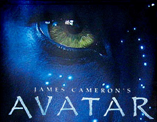
This font is dark yet suspensful. It is Serif font and this goes well with the storyline of the film aswell as the picture behind it. The font shows that the storyline is on a serious matter- entertainin yet educational. The directores name is written smaller than the title so that the focus is on the name of the film.

This is the font of a comedy movie. The font is
Sans Serif implying that the movie should not be taken serious, incase sensitive people may take offence of the title. Comedy movies should have big clear fonts like this so that people remember the name and it shows that it is a less complicated film. The use of a white background is good as the focus is on the title, actors and picture.

This is a Poster for an Action movie. The font is San Sarif howerver it is still taken seriously. I think that the fact that it is in
CAPITAL LETTERS and ITALICS helps do this. The text is kept discretly on the poster so the focus is on the photo. Since it is already a well known film the font doesnt need to be so big as people already know what the film is.
No comments:
Post a Comment