Thursday 27 January 2011

More Researched Font Analysis...

As we were shown, different fonts are used for different movies. At first they may all appear to do not much at all, but they are somehow crucial. For our As Thriller, we are also asked to include a title and think about the font. A font should go with the film, for example, an old film (a film set in olden times) would have a serif font and a newer, more modern film (set in the present time) would probably use a sans serif font, the size (width and height) and the colour of the font.
So knowing that the font is an essential part of our thriller, as we will need to use it for our title sequence (for which we will use a program on the iMac called Livetype), I decided to do my own little bit of research into fonts to get a better idea of what kind is used for what type of film:


In this poster you can see a big guy, which is represented in the font. The two most significant words are big and bold and yellow, which matches the word fire and the fire in the background. This font seems to be used for a crime thriller.


This is a more sweet, girl-y font. Thin and sophisticated lines, make it look more of a film whose main character is a female.  It somehow portrays innocence but with a twist, this thought comes from the whole poster as opposed to just the font.
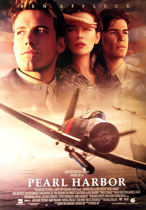
This font looks more like something used for an action thriller. The is 'O' shaped as an eye. And as the previous font, this one has thin lines, also representing a female, but using capital letters giving it a more action-type edge to it.


This font seems to be more for a psychological thriller. The black letter with the white background, and the ink sort of running down which may represent loss. The incorporation of a head in the poster really gives it the psychological thriller feel. The font seems as it if were typed, like a creepy letter with the ink running down, it really plays with the mind. 


James Cameron, Avatar- Font Analysis: 


Original Poster
The subtitles for 'Avatar' in Papyrus font

 James Cameron used the Papyrus font for his film title, and he also used it in the subtitles for his film, 'Avatar'. Critics say it was a little over the top, however, I think he deserves a little credit for doing something different. I do agree with the critics however, as the font does not really link to the film but we somehow, as viwers, have gotten used to the font and really relate it to the film. (Original poster shown above the text).
However, with all that taken into account, can you imagine if it was done with comic sans font? Well you can see how it would look (below). 


The poster if it were in Comic Sans

The subtitles if it were in Comic Sans

Thriller Audiences

In 2009, 503 films were released in the UK. Only 4% of which were Suspense/Thriller films. 


Action, animation and comedy movies count for 52% of the UK box office. This is due to a wide range of audience. Thrillers however are more selective with age restrictions, this narrows down an extremely large amount of audience. Gender also plays a bit role, because according to statistics, women are more likely to watch a thriller movie.


Response To the 'Watching' Documentary

1) What does Thomas Sutcliffe mean when he says ''Films need to seduce their audience into long term commitment. While there are many types of seduction, the temptation to go for instant arousal is almost irresistable''?
- Films should try and capture the audience slowly instead of beginning with a ''punch'' and they should make the audience want to watch the whole film. He says 'films need to ''seduce'' their audience...' and I think he means that it should start of slow and not rush into it as you wouldn't ''seduce'' a person by rushing into a relationship.

2) According to Director Jean Jacques Beineix, what are the risks of ''instant arousal''
- He thinks that is is bringing too much at the beginning and if the beginning has such high standards, the rest of the film would be hard to live up too.

3) Explain why ''a good beginning must make the audience feel that is doesn't know nearly enough yet, and at the same time make sure that it doesn't know too little''
- So that the audience remain interested throughout the whole of the film, if too much is given away right at the start, the audience will have too much to take in and eventually give up with watching the film. The balance of what the audience knows should balance what they don't know.

4) What does critic Stanley Kauffmann describe as the classic opening? Why does this work?
- The classic opening according to Stanley Kauffman is something that starts with an established shot - of the city/area,followed by a tilt shot - showing a building from top to bottom and then a close up - of a window from the building.

5) Why is Kyle Cooper's title sequence to the film Se7en so effective?
- It goes with the style of the film and it foreshadows the things that are going to happen. 


6) What did Orson Welles want to achieve with his opening to the flim A Touch of Evil? What did Universal Studios do to it? Why?
- Welles did not want to have any music in his opening scene but Universal Studios did and in the end the studio won. He did not want any music in the beginning because he thought it would have more of an effect without it.

7) What is meant by ''a favourite trick of Flim Noir" ? What is the trick?
-The trick is where the ending of the film is actually the beginning. Telling the story backwards.

8) How does the opening to the flim The Shining create suspense?
- The type of music used and the fact that it was shot from a helicopter makes the car look so small it ''follows them like a predator''.  


Structure Of Openings With Examples

In this lesson we learned about the different structures of the openings to thriller films. We were given examples of very structure.
A narrative opening with the titles running throughout- An example of thriller films based around this are 'The Stepfather' and 'The Shinning'.


- A Discrete title sequence- An example of thriller films that involve around this are 'Seven' and 'Arlington Road. 


Titles over a blank screen, followed by the narrative opening- An example of a film that does this is 'Donnie Darko'. 


Stylized Editing opening- An exampe of thriller films that have this are 'Mezrine' and 'Pelham 123'.


Font Analysis

The font is an important part of the thriller movie, used to present the credits and titles. We looked at two different fonts most commonly used to design title sequences. This is very important and must be carefully thought about, these are as follows:

Serif Fonts- Such as Times and Courier
Serif fonts are generally more traditional and often slightly more formal than sans serif fonts. (A serif is the extra little detail at the end of each stoke of every letter)


Sans Serif Fonts- such as Ariel and Comic Sans
Sans serif fonts are generally more informal, more modern and more 'friendly'

Font Analysis-
What does the font PALATINO suggest as used in the promotion of PEARL HARBOUR? It shows that it is quiet formal and important as it stands rather tall (letters). It is in the middle of the poster and all in capital letters so it stands out more clearly. Serif seems to connote old style font for a historical movie.


- Rocky used the font Franklin Gothic Heavy. The font was chosen in this way because it was bold and big. In some way very broad. The Sans Serif is much less formal and more entertaining. The character Rocky is simple ordinary character so its reflects his persona. The Title looks as if it is punching through the poster as it can barely fit. This further reflects the name.

The Lurpak Advert


On the 18th of January, we watched an advert by Lurpak that was shown in the cinema. It shows a young guy in the process of making an omelet. The idea which looks or appears to be very dull (a man making an omelet) into something so dramatic, so suspenseful. 


With the wide range of camera angles and suspenseful, tense building music this has to be seen as a very creative and inspiring sequence. 


The clip starts with a low to high angle shot between kitchen objects and zooming in to the eggs, and then moving up the fridge creating suspense and tension. 
I like the way they zoom-in/ focus-on the eye when the man is looking into the fridge and on his fingers when he's tapping the handle, the whisking and cracking of the egg at such a close range, the salt and the bubbles. It's this use of detail that really makes the sequence special and provides it with the suspense.

Livetype and Sound

In class we learnt how to use Livetype and Soundtrack Pro properly. Livetype is a program used to make and edit opening credits to make them look extra flashy while Soundtrack Pro is used to make the soundtracks for video clips.

With Livetype there are many effects to choose from to make the words stand out like transitions i.e. fade. You could also change the colors and the background effects. I experimented with the program by writing my name and messing around with all the available features. I changed the font type and added some animation and then changed the background. I did all of that to familiarise myself with the progam.

Soundtrack Pro was the other program we used was Soundtrack Pro. It was used to make the background music of our bag swap. This was more fun to use as the variety of different sounds that were there were really interesting and some of them were quite funny. I also experimented with this program by playing around with the sounds and mixing them about to make the best sound for the bag swap clip.

In the end, the whole group sat together and found the best sound and edited it into the clip. To do this we had to add the video to SoundTrack Pro and place the music underneath.

Livetype and Sound

Introduction To Editing

In Today’s lesson (18/01/11), we edited the bag swap clip. When we watched our clip back we was not very happy with it and thought it did not really go with the theme we were suppose to do, so we decided to do it again and change the whole story. The idea behind this was to have 12 different shots/scenes, which the bag swap takes place with either one or both characters know about it. We Edited a little bit of our work, put the ‘in’ and ‘Outs’ on sections we wanted, and added them to the final clip sequence and add effects like dissolve the clips, by using the software ‘Final Cut Pro’.

Next Lesson (20/01/11) we will be able to continue editing and experimenting with a few more effects. EG: Slowing down the clips, adding music and increasing the speed. 

Animatic preliminary exercise

Wednesday 26 January 2011

Lurpack Advert

The new Lurpack Kitchen Odeysseys advert is actually amazing. The use of effects on simple everyday activities like making an omlette is made to look so dynamic. The diractor uses slow motion and zooms in to make objects appear bigger than they are- This has the effect of making the viewer feel as though they are in the clip. A range of shots are used: Long shots, Close ups, Wide shots and many more to see the activities from many aspects.
I really hope to use some elements of this advert in our final film- even though it isn't a thriller.

Tuesday 25 January 2011

Thriller audiences

THRILLER MOVIES FALL BETWEEN HORROR AND SUSPENSE MOVIES AND SO THEREFORE IT HAS A SHARED AUDIENCE OF BOTH MEN AND WOMEN.
Picture of -  Stepfather (2009)Picture of -  What Lies BeneathPicture of -  Deja Vu


ABOVE ARE THREE THRILLER AGE CERTIFICATES OF WHICH I HAVE FOUND.
FURTHER RESEARCH SHOWED THAT THE VAST MAJORITY OF THRILLER DVDS ARE RATED AGE 15 WITH ONLY FEW WITH THE AGE 12 RATED CERTIFICATE.
I FOUND THAT ACTION THRILLERS ARE USUALLY AGE 12 RATED WHEREAS PHYSOLOGICAL THRILLERS ARE RATED AT AGE 15+


Action, animation and comedy account from 52% of Box Office in the UK in 2009. This is due to the fact that these genres are certificated to more of a younger age range, allowing a wider audience - from very young to old.
Take the movieTOY STORY 3 as an example; it had the  certicate of PG and so the range of audience is wide. this enabled it to be one of the most successful 3D movies.

Picture of -  Toy Story 3
Thrillers account from quite a low proprotion of UK Box Office takings (4% in 2009) because its range of audience are restricted. Rather than catering to the 'young' crowd who watch movies more, most thriller movies specifically show for those who are more mature.

Thriller Audiences- Who watches thrillers?

An important point to consider when making a film is your target audience. Who watches thrillers?


1. How many suspense films were released in 2009? How many films were released altogether last year?
In 2009, out of 503 films released, only 31 were thrillers.
2. Action, animation and comedy account for 52% of Box Office in the UK in 2009. Why do you think these genres are so popular?
Mainly because it is children and teenagers that go to watch these movies, and when you look at the figures for thriller movies you can see the huge difference. This is primarily down to age restrictions on thriller films.
 3. Why do you think Thrillers account fro quite a low proportion of UK Box Office takings (4% in 2009)?
Primarily due to age restrictions. 
 4. Looking at the 'genre by gender' diagram above, what information can be derived about Thriller audiences and gender?
 Thriller is seen as a more male genre due to the inclution of action and crime in them, however, they do also include suspense, which by what the diagram tells us is more a female than a male thing to go and watch.
 
5. Look at the age certificate for 10 of the films featured on the teaching blog. What does this tell you about Thriller audiences?


The 'Watching' documentary

'Watching' is a half hour documentary about film title sequences. They talk about the beginnings of films and how its really, a make or break moment, where you need to give the audience enough but not too much.
The documentary shows mainly film producers, writers and directors talking about openings, some saying that you should start the film with something that will really impact the audience, something that will really want to make them continue watching (as before, trailers were actually the opening of the film, and opposed to now were mostly the best bits, or what are thought to be the best bits are put together to form this exciting and audience luring device). Some believe that if you start strong you really set a standard for the film, and in most cases this is the best part of the film which the audience have already seen through the trailer.
The documentary also focuses on fonts and credits at the beginning of films, which can sometimes, in the opinion of some, can destroy their idea or vision for the opening. 
An opening should be about seducing an audience, but not smothering them. Starting too strong, too open, can really ruin a film, setting the bar so high, it can, most likely, become unreachable. If you plan on doing so, you really need to have a few more tricks up your sleeve to really shock or surprise or keep the audience interested. It is like, as many times, we go to see a film and we think it was great, and a while later, due to high success rate they do a second, or even a third film, and this can sometimes ruin the films reputation. A first film, will more often than not, be the best, and specially if it has a high success rate, making a second would just be like throwing away all of that. In conclusion, you should not be to quick to seduce an audience, nor leave them waiting, or they will bore quickly and get into their minds that you are not worth-it or you are not what they are looking for.

Here are the questions we worked on while watching the documentary (documentary and answers will be uploaded soon):